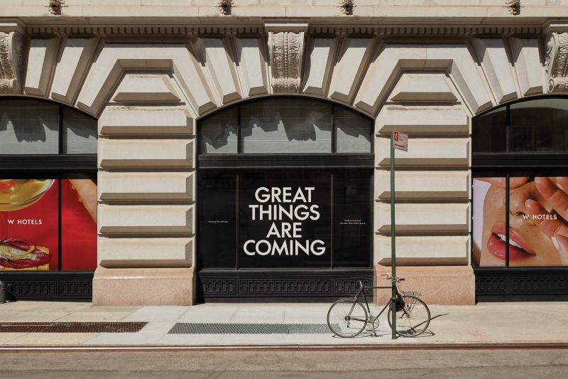
If W Hotels has appealed to your creative soul for the past decade, it’s because you’re their target audience. Billing itself as bold, colorful and unabashedly fun, it was considered a pioneer of luxury hospitality in 2010s art and design. But well, things have changed. Competition is fiercer than ever and tastes are changing. Today, the very meaning of luxury is moving away from “tangible” luxury and toward subtle positioning, with people understanding that they want fewer photo-ops and more holistic experiences.
But how can you incorporate this new offering into your branding? Porto Rocha has been instrumental in the hotel group’s revamp around the idea of “luxurious and liberated”. What exactly does that mean? “We’ve gone beyond old aspiration signals and created a vibrant and sophisticated system designed to scale,” Global Studio explains. This is achieved by balancing “bold expression with intentional subtlety” across W Hotels’ 65+ global locations and unique property types, including resorts, residences and urban escapes. We created a new visual identity that applies.


The system Porto Rocha has created accomplishes two different but equally important objectives: attracting new guests through high-profile marketing and enhancing their stay once they enter the hotel. As such, the studio introduced a vibrant color palette, artistic photography, large typography, and declarative messages in its promotional materials. Once inside the premises, however, the brand’s expression becomes more subtle, with an emphasis on a neutral palette and tactile materials and finishes. It’s this approach that expects you to hit the right notes.
Porto Rocha has simplified its logo lockup, information hierarchy, and brand architecture while maintaining the iconic “W” symbol found on the tops of buildings around the world. We chose a single-sized wordmark that was integrated with the W symbol itself, transforming the previous vertical lockup with multiple fonts into “W HOTELS” to create impact. Describing it as something similar to a fashion house’s logo, the approach aims to inject further confidence and flexibility into the brand.


This effort resulted in a custom typeface developed in collaboration with Lineto. This typeface takes the geometric features of the logo and extends them into each letterform. The result is W Supreme, a fully functional typeface packed with expressive and elegant charm. To ensure consistency across languages, Porto Rocha introduced a custom W Supreme Arabic script and alternate scripts for Chinese and Japanese. New typefaces open up a world of possibilities for brands to communicate themselves without relying too heavily on logos.
As you can imagine, color and imagery played a big role in expressing this new luxury vision. “We developed a broader palette to replace the previous neon, giving the brand a modern feel while maintaining its attitude.” Interestingly, color combinations were defined by location. The lifestyle image also has regional characteristics, “from the white slopes of W Aspen to the famous promenade of W Barcelona.” Porto Rocha collaborated with still life photographer Sergiy Barchuk to create a series of artistic brand photographs that will be used throughout the system.


“Since the rebrand, W Hotels has continued to grow, opening stores in Budapest and Edinburgh, partnering with new creators, and using the system to publish more than a dozen new content series. Luxury Past Their renewed identity, freed from the constraints of the world, has now established them on top of the world.”It concludes with “a tone for a liberated future.” And it’s a future that builds on the best of W Hotels’ bold heritage while embracing a more sophisticated and meaningful interpretation of luxury.


